Skip to content

Tag: Johnnie Winona Ross

Finishing up the most recent NYC gallery crawl

I’ve been completely remiss in getting this info to you in any kind of timely manner, for that I apologize. I have just had too much in my “little world” that needed attending to. Thanks for coming back to read the blog.

Douglas Witmer at the Painting Center.
I think by now you know I really like Douglas’s work so I’m not going to spend too much time about surface, process nor Douglas’s approach that essentially allows his paintings to sit in the world as what they are – paintings not representations of paintings or a desire for these objects to be something they are not. I find this approach really refreshing. It’s also a good thing that these are engaging and memorable artworks.

Douglas says “I want to believe that the relationship of painting values inquiry over conclusion.” I agree with this and believe that his works might just be doing this.

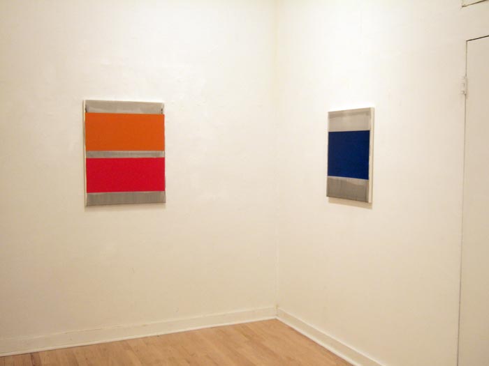
My two favorites from his show, Field + Stream, were Say So and Is and Isn’t. Especially Is and Isn’t with its field of deep blue that you can just sink into. The visual above is from the installation of both Say So and Is and Isn’t.

This show closed the day after I saw it, sorry about that.

Don Voisine at McKenzie Fine Art
It seems like everyone is writing about this show, so I’m not going to present any groundbreaking ideas here – I just want to say what a soild and well executed show this is. The few moments I spent with the gallery staff showing me additional works was also time well spent.

Voisine gets far too much mileage with what appears on first glance to be a jazz like riff on Russian Constructivism, which is a really unfair thing to say as the longer you spend with the work the voices of others quickly fade into the background and you are left with an artist making smart works that go beyond the traditional geometric sphere of approaches that so many artists have – and he becomes a crafty painter pulling surprises out of very seemingly mundane things.

For further reading on this great show, check out Joanne Mattera’s and Steven Alexanders blog’s.

LANDSCAPE AS GRID, Lloyd Martin and Johnnie Winona Ross at Stephen Heller.
I entered this show with a set of expectations pre-built in I know both of these artists work very well and the leit motif of the show suited them perfectly. Johnnie Ross’s work has parts of a landscape aesthetic this comes through in his titles and verbal dialog, however to call him a landscape painter doesn’t quite work for me. Although the impulse is there but, only through the dialog of his work not so much in reading the work alone. Admittedly I see more of the post minimal painters in his work and tend to shy away from the landscape readings – although they are there, quietly in the background.

Lloyd Martin’s work fits this perfectly, his gridded abstraction works with the rhythms of the urban environment and recalls some of the high points of early 1960’s abstraction while staying away from looking dated and stale, the painterliness of his work is engaging and allows the viewer to stay with the work to find unexpected surprises inside the gridded picture plane.

Gordon Moore at Betty Cuningham.
Gordon Moore’s work is new to me, however I was instantly taken with his paintings and paper works that mine an approach that is based not on reduction but of a restricted palette and approach. these paintings with the dissolving grid and neutral colors, have disparate parts that eventually relate to and reinforce the whole image. This connectedness seems to be the lynchpin that holds these artworks together. What becomes very apparent as you spend some time with the work is the expansive vocabulary that seems to come from the work. No matter how restricted that vocabulary may seem from a casual glance.

Highly recommended.

Leave a Comment

Johnnie Winnona Ross in Santa Fe

I found this rather interesting article about JWRs recent show (at James Kelly in Santa Fe) the other day. I have to say its a rather interesting take on a his exhibition. This passage in particular:

Too often artists rely on the sum of an exhibition to create the sense of a greater whole, even if the individual pieces fall flat. With Deep Creek Seeps, however, the desire is to get rid of the exhibition and focus on a singular work.

I can understand the approach the reviewer takes, especially in light of the few really powerful solo shows that have only had one work (in my mind the Eric Fischl show at Mary Boone in the early eighties comes to mind – among others). That said, its really quite a treat to read quality art criticism in a regional newspaper.

One last thing, I don’t see the “Rothko-ness” in JWRs work – I don’t see or feel the same approach to the spiritual or even the personal anxiety, just the opposite JWRs work seems calmer and more at ease with itself than Rothkos. Not that makes one better or worse, just different.

The whole article is here.

Johnnie Winona Ross, Dark Creek, 2008

Leave a Comment

Johnnie Winona Ross at James Kelly Contemporary (Santa Fe)

Johnnie Winona Ross dropped me a note the other day to let me know of a new show of his work – this time at James Kelly Contemporary in Santa Fe. It also marks a new direction in JWR’s art practice. By this I mean a horizontal rectilinear shape as opposed to a nearly square approach.

I will not be seeing this exhibition, however JWR is one of the more interesting artists I’ve stumbled across in the last few years. So if you get the chance, try not to miss it.

Deep Creek Seeps, 2008, Acrylic gypsum, titanium, zinc, various oxides, marble burnished on bleached linen, 48 x 72 inches

Leave a Comment

New York , Tuesday Nov 6, 2007 (post two of two)

Johnnie Winona Ross at Stephen Haller
JWR’s latest show at Stephen Haller clearly extends the vocabulary of approaches involved in building images in a reductive vein. JWR has placed his emphasis on the process as well as the final image, allowing the viewer to become engaged in the making of the artwork since it literally sits on and slightly below the surface. Concerns about the attachment of the canvas to it’s support are as evident as always via handcrafted tacks showing along the side of the stretcher.

The show, titled, Deep Creek Seeps, is a series of quiet paintings, that upon closer or longer inspection reveal themselves in unexpected ways, suddenly you become aware of just how much detail and concern is placed in each image. It may take a moment, but once you start looking, the artworks become as busy as the desert that they are so obviously inspired by. Let me take a moment to unpack that a little, the desert, to the average viewer is just that, sand maybe a cactus every once in a while. Once you start looking in depth at the desert you find a complex system of life, it’s always been there – you just have to look for it and possibly wait for it.

I’m always amazed at how many different elements actually make up a single piece in JWR’s work.

Extended play
JWR has just had hist first monograph published. Covering JWR’s work from 1995 to the present with writing from Carter Ratcliff and Douglas Drieshpoon only add to this gorgeous book. Published by Radius books, and designed by Skolkin+Chickey it is available in two versions – one a standard hardbound edition and the other a clamshell including the book and a limited edition print. It is available through Stephen Haller Gallery as well as being distributed by DAP.

The show runs through November 24th.

Jaq Chartier at Schroeder Romero
Jaq Chartier mixes science and art in creating cerebral and sensual artworks. Clearly the art side (painting) is the primary concern mixed in with a strong experimental approach to the images and the chemicals that make them. I’ve spoken about JC’s work here before so it should come as no surprise to see it mentioned here. The latest show at Schroeder Romeo continues with works from the “testing” series. These are the images that initially interested me in JC’s work, I think you will find them interesting as well.

The show runs through November 24th.

Richard Prince at the Guggenheim
This show was everything I wanted it to be. That said, I’ve talked about RP way too much over the last couple of months – so this will be short. The best pieces for me are the car hoods. I’ve read interviews that RP thinks that maybe the car hoods are to minimal – and he’s right, they are. However, they are stripped down and out of step with the rest of the work, and to me that speaks volumes about the core subject of the artwork and the changes that have been made and will continue to be made in the future.

I once read a review of the girlfriend images and the author referred to them as the sexiest images of women she had seem in a long time. I realized that she was right, I wish I could remember who wrote that.

The show runs through January 9th.

Leave a Comment